The default UINavigationController transition animation when pushing/popping views is straight-forward; however, what if you want to do something a little more fancy? Enter custom transition animations!
In this two part series, I’m going to show you how to create a custom transition between a UICollectionViewCell and a UIViewController. The goal is to have the finished product look and behave much like the App Store “Today” view.
Part 1 of this series will focus on the creation of our views to animate between. Part 2 is where we will start discussing how to implement the custom transition animation. So with that, lets dive right in!
TL;DR: Click here for the finished project. Refer back to the sections below for explanations and reasoning.
The elegant animation above looks simple at first glace, but don’t be fooled - there are a few things going on here. Lets break the animation down.
Tapping on the card while in the list view:
- The card moves to the top of the screen with a spring animation
- The card resizes to fill the screen with a linear animation
- The text stays pinned to the edges to follow the resize animation
- The close button appears
- Rounded corners become square
Tapping on the close button while in the full screen view:
- The card moves to its original position within the list view with a spring animation
- The card resizes to its original size with a linear animation
- The hero image comes on screen (if scrolled off)
- The text stays pinned to the edges to follow the resize animation
- The close button fades away
- Square corners become rounded
Now that we have an idea of what we are trying to accomplish, lets get started!
Boiler Plate
Lets get our boiler plate out of the way. The view hierarchy of this app goes like this:
Navigation Controller > Card List View > Card Cell > Detail View
For this project, I’ve created a subclass of UINavigationController (cleverly) named NavigationController. We will use this subclass later so that we can tell the navigation controller to use our custom transition animation. However at this point, it’s just a boring, empty subclass:
class NavigationController: UINavigationController {}
The root view of the navigation controller is a UIViewController with a UICollectionView as a subview. For simplicity, I’ve set the Card List View to layout 10 identical cells in a vertical fashion.
class CollectionViewController: UIViewController {
 @IBOutlet weak var collectionView: UICollectionView!

 override func viewDidLoad() {
 super.viewDidLoad()

 self.collectionView.dataSource = self
 self.collectionView.delegate = self

 // Set the cells sizes and layout direction
 let layout = UICollectionViewFlowLayout()
 layout.itemSize = CGSize(width: 335, height: 410)
 layout.scrollDirection = .vertical
 layout.minimumLineSpacing = 30
 layout.sectionInset = UIEdgeInsetsMake(16, 16, 16, 16)
 self.collectionView.collectionViewLayout = layout

 self.collectionView.register(cellType: Cell.self)
 }
}

extension CollectionViewController: UICollectionViewDataSource {
 func numberOfSections(in collectionView: UICollectionView) -> Int {
 return 1
 }

 func collectionView(_ collectionView: UICollectionView, numberOfItemsInSection section: Int) -> Int {
 return 10
 }

 func collectionView(_ collectionView: UICollectionView, cellForItemAt indexPath: IndexPath) -> UICollectionViewCell {
 let cell = collectionView.dequeueReusableCell(for: indexPath, cellType: Cell.self)
 return cell
 }
}

extension CollectionViewController: UICollectionViewDelegate {
 func collectionView(_ collectionView: UICollectionView, didSelectItemAt indexPath: IndexPath) {
 let vc = DetailViewController.instantiate()
 self.navigationController?.pushViewController(vc, animated: true)
 }
}
For now, the Card Cell (CardCell) and Detail View (DetailViewController) are also just empty subclasses.
class CardCell: UICollectionViewCell, NibReusable {}
class DetailViewController: UIViewController, StoryboardBased {}Pro-Tip: If you don’t know already, I’d like to let you in on a well known secret that will make your life so much easier. I’ve been leaving you a trail of bread crumbs (
StoryboardBased,.instantiate(),NibReusable,.register(cellType: Cell.self), etc.) - did you notice? This is the handy work of AliSoftware, a set of protocols used for initializing views.So instead of instantiating the old cumbersome way:
let view = NSBundle.mainBundle().loadNibNamed("CustomView", owner: self, options: nil).first as? CustomView

let storyboard = UIStoryboard(name: "MyStoryboardName", bundle: nil)
let controller = storyboard.instantiateInitialViewController()
You could be doing it like this:
let view = CustomView.loadFromNib()
let controller = MyStoryboardName.instantiate()
Do yourself a favor and check out the Reusable project on github and be happy!
Now that we have the boiler plate out of the way, lets talk about creating our views.
Creating UI for the Transitioning Views
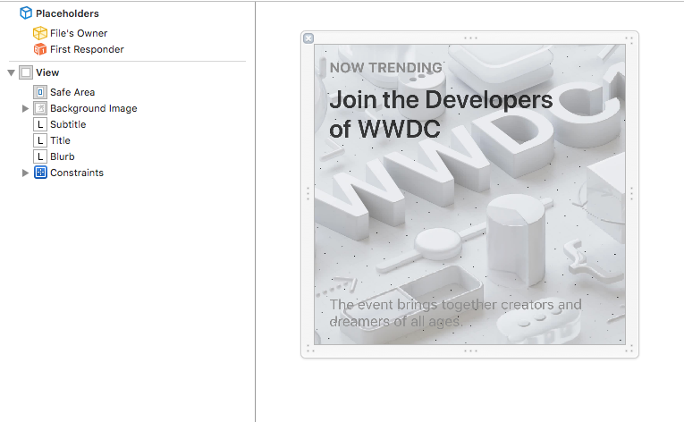
From the animation above, we can see that the Card Cell essentially morphs/grows into the full screen Detail View. From this, we know that these views will share a good chunk of the same UI. We can therefore be a little resourceful by creating a Common View (CommonView) to hold the shared UI elements.
Common View
This view is responsible for holding pretty much everything we see in the Card Cell.
These things consist of:
- Background image
- Subtitle
- Title
- Blurb
Using a UIView as the superview, I simply add the three UILabels as subviews and constrain them as follows.
Subtitle Label
- 16 top to superview
- 16 left to superview
Title Label
- 16 top to subtitle bottom
- 16 left to superview
- 16 right to superview
Blurb Label
- 16 left to superview
- 16 bottom to superview
- 16 right to superview
Both the title label and the blurb label I configured to allow for multiple lines by setting Lines to 0 and Vertical Content Compression Resistance to 1000.
The background image is probably the most interesting part. Notice in the animation that the image appears not to resize with the view, but instead as the view grows, more of the image is revealed. There is definitely a more robust way of doing this, but for simplicity, I simply add a UIImageView to the superview and constrain it as follows.
Background Image View
- Center horizontally to superview
- Center vertically to superview
- Height equals 500
- Width equals 500
Why 500 you ask? Because it’s wider than the currently widest iPhone. (Again, not the most robust. But it will work for demo purposes.)
Finally, set the Content Mode of the UIImageView to Aspect Fill.
Card Cell
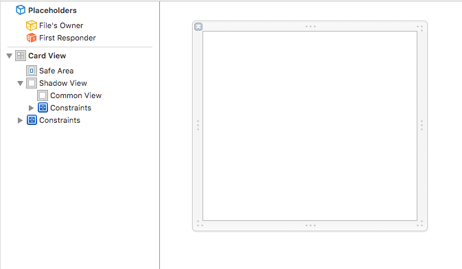
Before we start making our Card Cell, there is one more thing I want to do to help make our lives a little easier. Notice in the demo how the card has a shadow? No big deal right? Just adjust the layer property of the Card Cell to have a shadowRadius and set masksToBounds to false and we are all set. Right? Well, unfortunately not. Notice how the card not only has a shadow but also has rounded corners. How can we achieve rounded corners when we need maskToBounds set to true but we need it also set to false for a shadow? The short answer is we need to use two views. One view to be the shadow and the other to round the corners of our view.
So what I’ve done to solve this is create another view (ShadowView) which simply sets its layer properties to show a shadow similar to the ones used in the App Store.
import UIKit

class ShadowView: UIView {
 override init(frame: CGRect) {
 super.init(frame: frame)
 self.commonInit()
 }

 required init?(coder aDecoder: NSCoder) {
 super.init(coder: aDecoder)
 self.commonInit()
 }

 func commonInit() {
 self.layer.shadowRadius = 8
 self.layer.shadowOffset = CGSize(width: 0, height: 8)
 self.layer.shadowOpacity = 0.25
 self.layer.masksToBounds = false
 }
}
Now that we have our shadow view, we can very easily make our Card Cell. To do this, we update the CardCell xib so that our outermost view is the shadow view and add our CommonView as a direct subview via the NibOwnerLoadable protocol. Constrain these views to the edges of their corresponding superview and we are done! Well…mostly. We just need the following code to make our corners rounded.
NOTE: This could have been done within the xib, but I’ve chosen to add the corner radius programmatically to better show you what is going on.
class CardCell: UICollectionViewCell, NibReusable {

 @IBOutlet fileprivate weak var commonView: CommonView!

 override func awakeFromNib() {
 super.awakeFromNib()

 // Round the corners
 self.commonView.layer.cornerRadius = 10
 self.commonView.layer.masksToBounds = true
 }
}
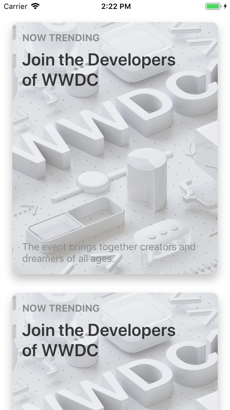
Voila, we have a beautiful looking card.
Detail View
The final and definitely most involved view is the Detail View. But let’s take a step back a moment and talk about how our transition between the Card Cell and Detail View will work. When a user taps on a card, we will (very sneakily) overlay the Detail View on top of the Card Cell and then grow the Detail View until it is full screen. Pretty neat! But how do we do that so that the user doesn’t know what we are doing? Well, we have to construct our Detail View in such a way that it can look exactly like a card (with a shadow and corner radius) and also like our full screen view. With that said, lets start in interface builder.
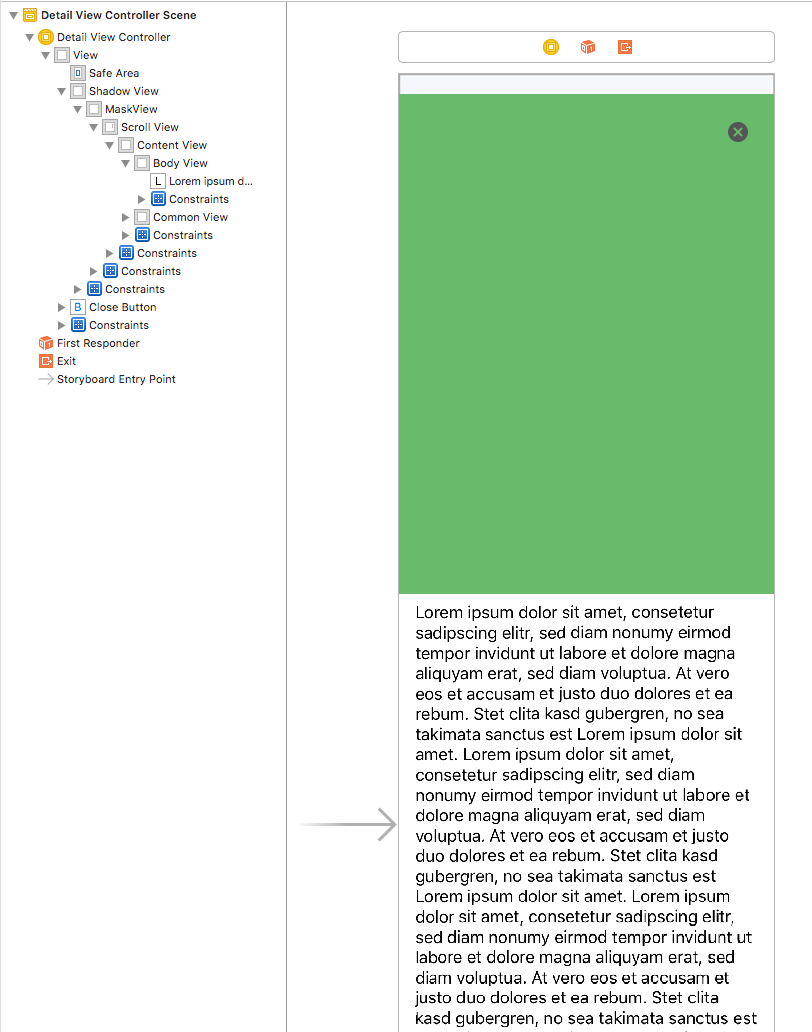
Because we need our view to be able to look like a card, we start off with a similar hierarchy to the CardCell in that we add the ShadowView and a UIView (that I’ll call the mask view) to the view controller and constrain their edges to their corresponding superview. The mask view is what we will use to round the corners of the view controller when it is imitating a card.
Next we will want to add a scroll view as a subview to the mask view so that we can scroll through our content. I’ve covered this process quite extensively in this blog post so please check it out if you get stuck here. Again, constrain the scroll view’s edges to its superview.
Next, add our CommonView to the content view of the scroll view and constrain its top, left, and right edges to the superview and set its height equal to 500. Then add another view and name it “Body View” and constrain it as follows.
Body View
- 0 left to superview
- 0 right to superview
- 0 top to Common View
- >= 0 bottom to superview (the reasoning for this is explained in my blog post mentioned above)
The body view will contain our lorem ipsum text, but feel free to do whatever you want here.
IMPORTANT NOTE: Make sure to order your common view BELOW the body view in the view hierarchy. This means that when push comes to shove, the common view will appear over the body view.
Finally, constrain a close button 16 points from the top and 16 points from the right of the mask view.
In the end, your view structure should look like this.
The only things left to do is hook up some @IBOutlets for future use to our swift class, provide a way to toggle rounded corners, and hide the status bar.
class DetailViewController: UIViewController, StoryboardBased {
 @IBOutlet weak var maskView: UIView!
 @IBOutlet weak var scrollView: UIScrollView!
 @IBOutlet weak var commonView: CommonView!
 @IBOutlet weak var bodyView: UIView!
 @IBOutlet weak var closeButton: UIButton!

 // Constraint from the top of the CommonView to the top of the MaskView
 @IBOutlet weak var topConstraint: NSLayoutConstraint!

 // Height constraint for the CommonView
 @IBOutlet weak var heightConstraint: NSLayoutConstraint!

 override var prefersStatusBarHidden: Bool {
 return true
 }

 @IBAction func closePressed(_ sender: Any) {
 self.navigationController?.popViewController(animated: true)
 }

 func asCard(_ value: Bool) {
 if value {
 // Round the corners
 self.maskView.layer.cornerRadius = 10
 } else {
 // Round the corners
 self.maskView.layer.cornerRadius = 0
 }
 }
}
If you were to run the app now, you could tap on any cell and it would push our Detail View. Tapping on the close button would pop back to the Card List View.

At this point, all of our views have been created. Check your progress here.
With that behind us, its time to start working with our custom transition animation! Head over to Part 2 of this two part series to get started.
Looking for more like this?
Sign up for our monthly newsletter to receive helpful articles, case studies, and stories from our team.

Business Model Canvas: Helping business leaders create meaningful digital products
January 17, 2024When it comes to custom software, it’s easy to feel stuck between needing to deliver value quickly, while also ensuring meaningful, long-lasting results. Learn why the Business Model Canvas can help you identify the right digital product for your business needs.
Read more
Build vs. buy: How to decide between custom software, off-the-shelf, or hybrid solutions
October 9, 2024Deciding whether to build custom software or buy off-the-shelf involves weighing factors like cost, flexibility, and scalability. While off-the-shelf solutions are quick and affordable, custom software offers more control and long-term adaptability. Sometimes, a hybrid approach combining both options can be the most effective for a business’s unique needs.
Read more
When to “shape up” versus be more “agile”
May 30, 2024Should you develop your new software using the Agile or Shape Up method? Here’s how to decide.
Read more
