In my years as a UX Designer, I’ve seen myself and many others struggle writing. At this point, I believe designers assume writing is a given skill that we all learned in school, but that doesn’t seem to be the case. UX Writing is a growing field that has its own constraints, goals and considerations that designers are not always aware of, and we typically underestimate the time and effort that good user interface text requires.
In this article, I’ve collected a few tips on how to write for user interfaces. Some of these I found online searching for best practices, and others, I’ve gathered from my own experience as a UX Designer for five years in the tech industry.
Write at seventh grade level
This tip doesn’t mean that the target users will be seven graders. Seventh grade is just a way to set a theoretical reference that we could still relate to. This means that we should make an effort to simplify the text as much as we can, not because we disrespect our users and think they can’t understand sophisticated language, but because the language should be clear and simple.
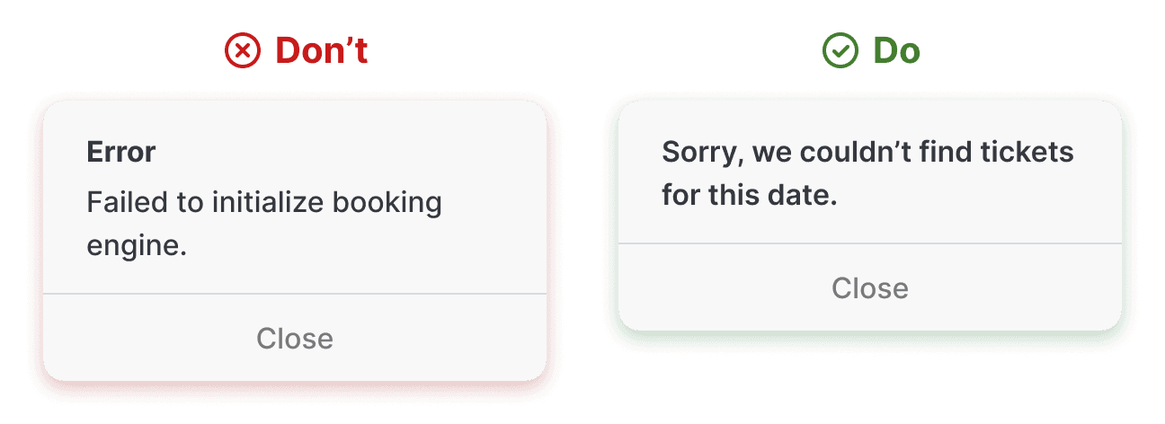
In this example the terms “initialize” or “engine” don’t respond to the language users might expect when booking tickets for an event. Straightforward and simple language is better. Imagine you’re on a hurry and you ask me for instructions but I use highly sophisticated poetic language. You would probably get annoyed. That’s what it might sound like if we use overly technical language. For products that have international impact, consider that your target audience might not be proficient in English.
Here, when showing an error message, it’s better to tell users what exactly went wrong, which can help them fix it themselves.
Be consistent in voice and terminology
Products are an important instance for brands to relate to their users and customers. Users, on their part, expect to relate to brands in a consistent way. Banks don’t sound like toy stores. If they did, users would probably worry. The voice of the product therefore should resemble that of the brand consistently. Writers should be aware of where in the spectrum of brand voice their products fall into (between funny and serious, casual and informal, and so on).
This doesn’t mean that if the product has a “funny” voice, it should sound funny in every single instance, even in high-stakes error messages. The tone should be adjusted to the specific circumstances within the product voice.
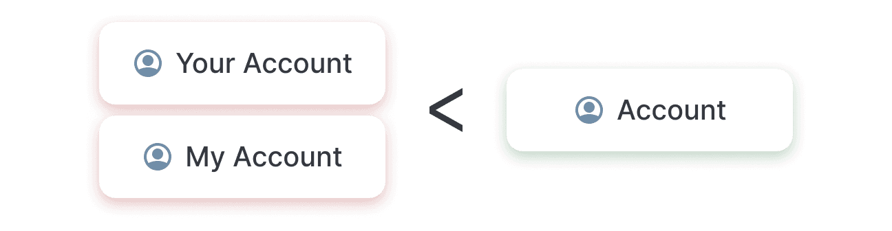
Another way to maintain consistency throughout the experience is to be aware of how we address the user and how we label user content. Sometimes products are named or use features named using “My” or “Your.” Think of MySpace, MyChart, YouTube, YouVersion, etc. I don’t think there’s anything wrong with that, but what I have seen is that keeping track of the convention adds effort to product development. I have seen products using both kinds of terminology, making it confusing to use. My recommendation is to avoid using such terms, and simplify it as much as possible.
A common reason I have encountered to label something “your” or “my” is when content users interact with could be confused as generated by the product or by the user. In that case, adding “your” to “your content” helps clarify what content we’re talking about. However, I think there’s other ways to label things that avoid using the possessive.
Clarity is key
This idea relates closely with the previous two above. In this case, the emphasis is in making sure users know what is being asked of them. A good way to increase clarity is by making calls-to-action more explicit.
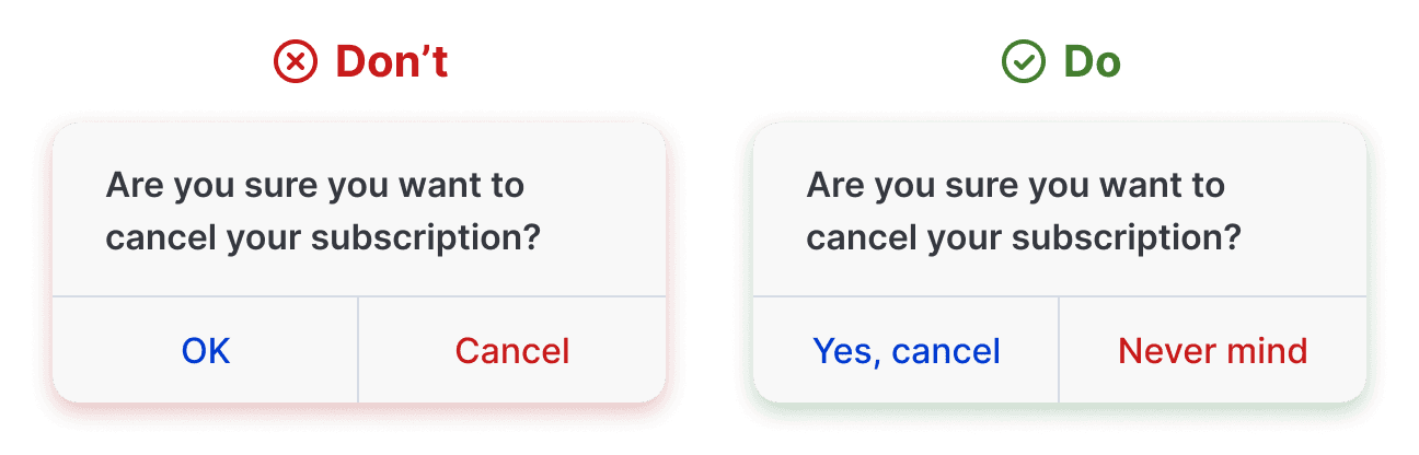
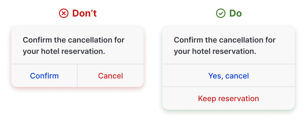
In this example, “OK” and “Cancel” are not clear enough to know what the buttons would do. Would pressing “Cancel” cancel the subscription or dismiss the message? The double negative (canceling the cancellation) is very confusing. The way to solve this is by making the text for the action more explicit. And don’t be afraid of making buttons a little longer!
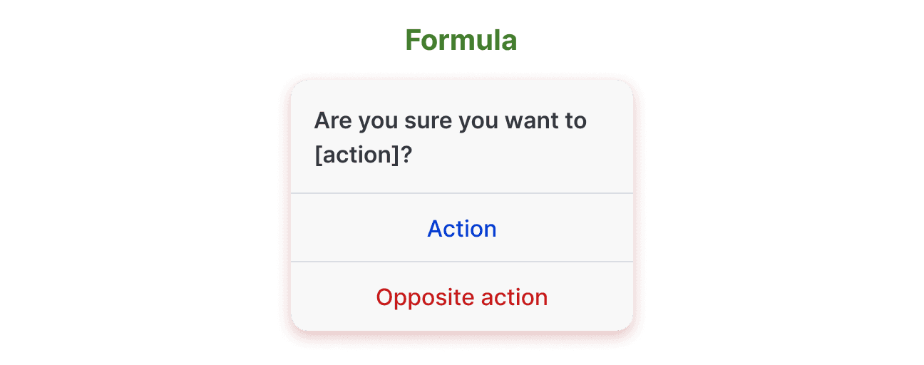
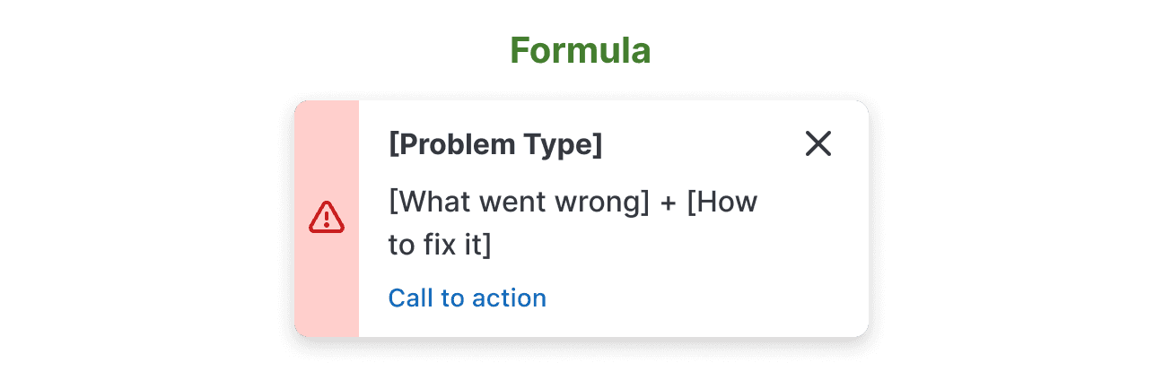
I’d suggest that as much as possible, we should avoid using “OK” and “Cancel” as labels for a modal buttons like this. Here’s a formula that works for many cases:
The action is stated clearly on the heading. The positive action reinstates said action, and the negative states the opposite action very explicitly. And just to bring the idea home, here’s another example on how the double cancellation could be solved.
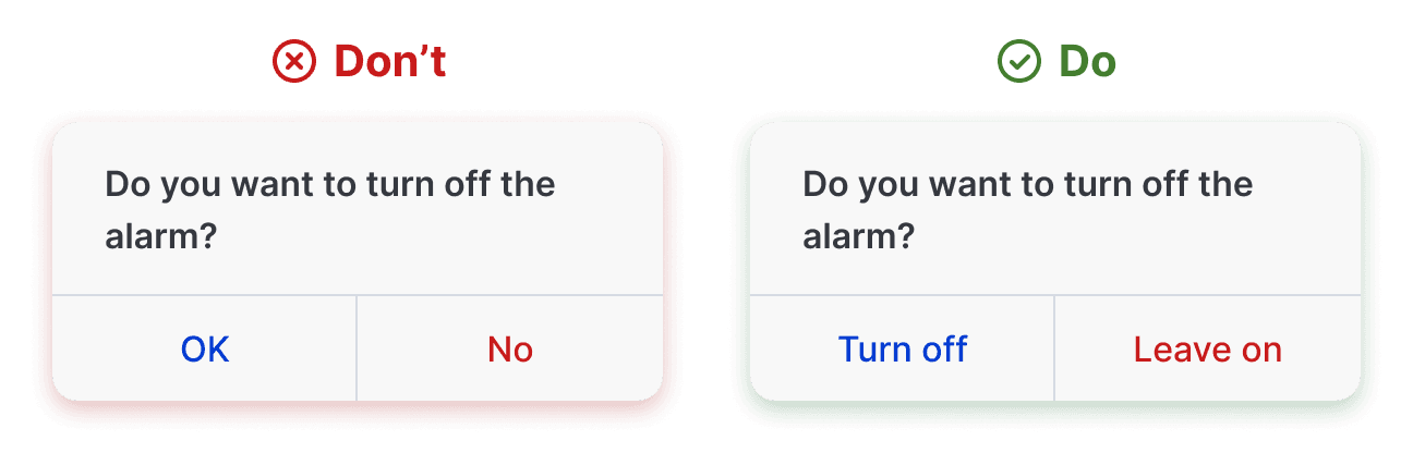
Even though the main action is negative (to cancel a reservation) we emphasize the action with the “Yes” because the user is actively deciding to take such action. In this case, the button labels are also longer than usual and are shown stacked. This is a modal variable that comes for free when developing for iOS and Android. Here’s a final example for good measure.
Account for user goals
What is the user trying to get done? Your message should be structured around that goal. This means thinking ahead of what the user will understand from the message and how they could react to it in very concrete ways.
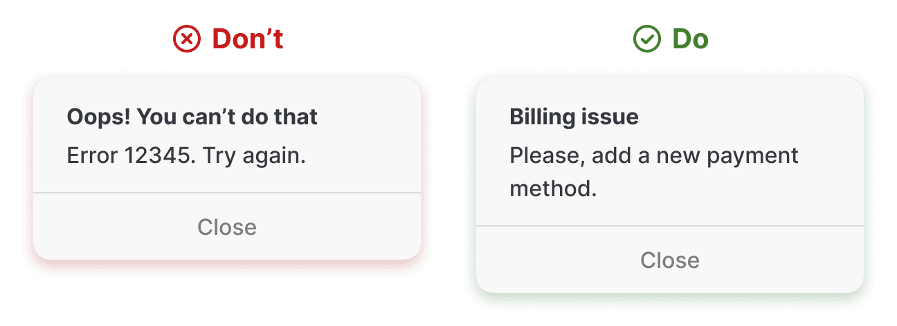
In this example, the message on the left doesn’t explain what the error is or what the user is supposed to do to fix it. It’s probably technical language that made its way to the end user. But the end user doesn’t need to see that, in fact, it’s confusing and counterproductive.
In my experience, this error is typically due to oversight, and it is often the case that the overly technical language comes from designers or developers mindlessly using terminology that is used internally in product development. To make things easier, here’s another formula that could help:
First, we state the problem with a certain degree of specificity. It’s not just “Error,” it’s “Billing Error” or “Booking Error.” Then, we explain briefly what went wrong, and most importantly, what the user can do to fix the problem on their own, if possible. If there’s nothing the user can do, we should still state that. For instance (“try again later” or “you may close this tab” work in some cases).
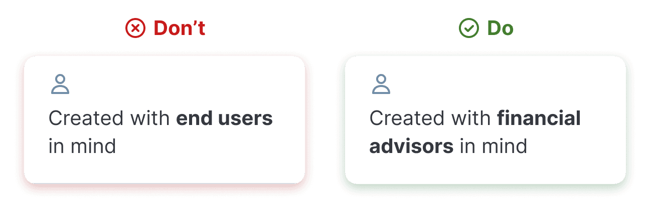
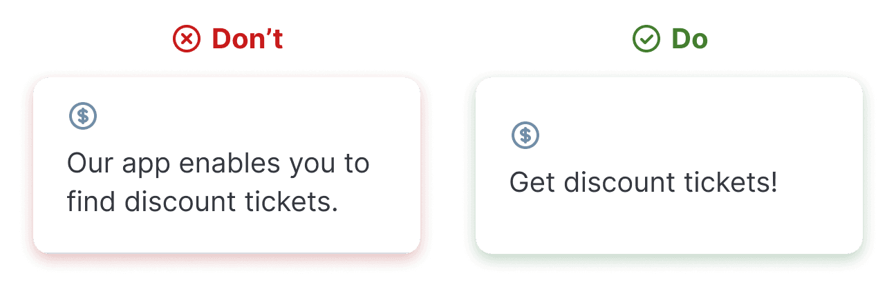
On a different note, oftentimes we keep a very generic view of end users, and we do what I just did: we call them “end users.” Our products are however tailored for a very specific group of people, age groups, occupations and mindsets. Whenever it is appropriate, it’s better to use that language to avoid alienating our users.
In other words, stating that a product is “created with end users in mind” actually demonstrates the opposite. Many times we use very similar statements that only tell but not show that we care about users.
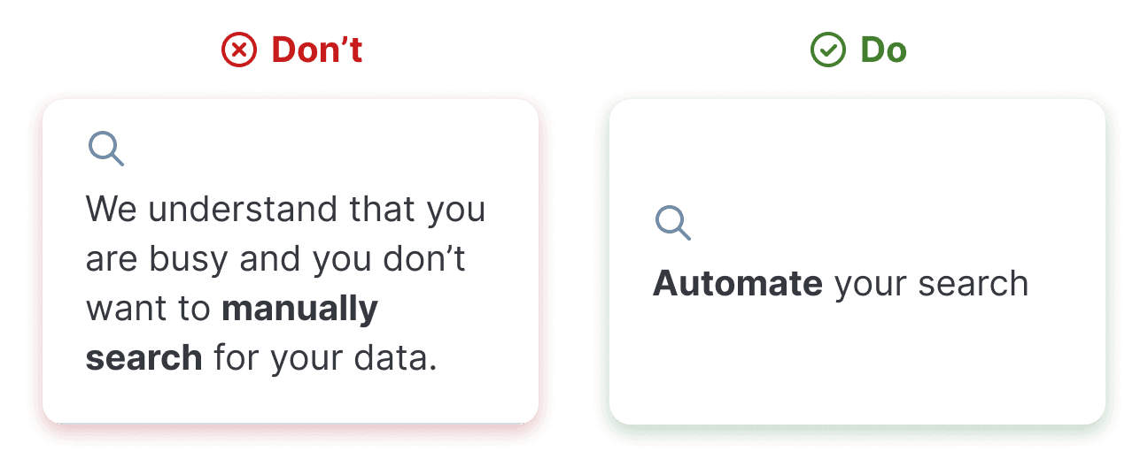
Keep it simple
This final tip might be a repeat of the previous ones. Simplicity, clarity, consistency might all be part of the same idea. Here though, I want to call out how marketing language sometimes seeps through UI copy but hinders the experience. For product design, I’d recommend having a much more neutral and straightforward language, without adding flare or exaggeration to a feature or product description.
Marketing language and SEO strategies are not usually fitting for product design. This doesn’t mean to have cold language, but to emphasize clarity over emotion. Unless you are a very skilled writer who is aware of the brand strategy, I would recommend keeping the UI copy very simple and clear. If the user had to choose between encountering a clever piece of copy and clearly understanding how to use the product, they’d definitely choose the latter, not the former.
Other tips to write
The tips in this article are not exhaustive, and there are many more tips and examples that could be added to this list. In an effort to cover even more cases, let me leave you with three final high level tips that should help you in most cases.
Keep the user in mind, not only the technology: putting yourself in the user’s shoes is the single most important way of approaching writing.
Ask your internal team or stakeholders if there is documentation on terminology, voice, etc. that can help inform future designs. Don’t reinvent the wheel, someone might have already done this for you.
As much as possible, ask for feedback on your writing to someone who is not closely associated with the project, and see if they can understand.
Surely, applying these simple tips will improve your UX writing skills substantially!
Sign up for our monthly newsletter to receive helpful articles, case studies, and stories from our team.
Team
Lessons Learned from our Associate Developer
September 13, 2023
One of our Associate Software Developers, Rohit, reflects on his time at MichiganLabs working on a short-term project, what he learned about real-world development, and the software consultancy business model.
The value of AR for business leaders (and when not to bother)
April 24, 2024
Should you leverage AR for your new digital products? Should you build an app for Apple’s Vision Pro? Discover four common use cases for AR and when to focus your energy elsewhere.