BLOG

Trending topics:

Learn a practical framework for how digital leaders can focus their efforts, make smarter tradeoffs, and deliver meaningful results in 2026. Even with tight budgets and shifting priorities.

Discover how mid-sized organizations can focus on the right digital investments: small, targeted moves that solve real problems and deliver ROI.

Struggling with shifting priorities, misaligned teams, or underused tools? Learn why digital strategy feels hard and how to regain clarity and momentum.
Smart takes and real stories from the digital product world
Choose the content that fits your focus. Whether you're shaping digital strategy, leading a team, or just want to stay connected, our newsletters are built to meet you where you are.
Learn a practical framework for how digital leaders can focus their efforts, make smarter tradeoffs, and deliver meaningful results in 2026. Even with tight budgets and shifting priorities.

Learn how to frame AI ideas in business terms that earn leadership buy-in, align with strategy, and turn strong concepts into measurable results.
Struggling with shifting priorities, misaligned teams, or underused tools? Learn why digital strategy feels hard and how to regain clarity and momentum.
Discover how mid-sized organizations can focus on the right digital investments: small, targeted moves that solve real problems and deliver ROI.

Learn how to build a trustworthy AI inventory forecasting system—with explainability, clear visuals, and tools your team can actually use.

Explore how a quick computer vision prototype can validate defect detection in manufacturing: saving time, reducing waste, and de-risking automation.
Is your company ready for AI? Discover why data maturity is the critical first step. Learn practical ways to assess and improve your data and explore the role of cloud infrastructure.

Explore the journey of Gradle and build tools like it, particularly in the context of Android development.

Can you clearly articulate your business strategy? Learn why the Business Model Canvas is a strong tool to deliver meaningful custom software products

Custom software development is about crafting digital products that solve real user problems and deliver tangible business value. Development is more than just writing code.

Product design, or UX design, is a strategic problem-solving process that leads to a valuable digital product. Learn what to expect when working with product designers.

Achieve success in your custom software by starting with product strategy. Discover the key questions to ask to align your digital product with business goals and user needs.

Delivery leads build great teams, provide excellent service to clients, and help MichiganLabs grow. Learn what you can expect when working with us!

To decide between a web app and a mobile app, consider your target users, budget, functionality, and long-term goals. Discover key differences.

Developers leverage open source software to give benefits like faster time to market, increased security and support, and ease of future maintenance.

Legacy APIs are complex, often incompatible, and challenging to maintain. Our digital product consultants and developers share lessons learned.

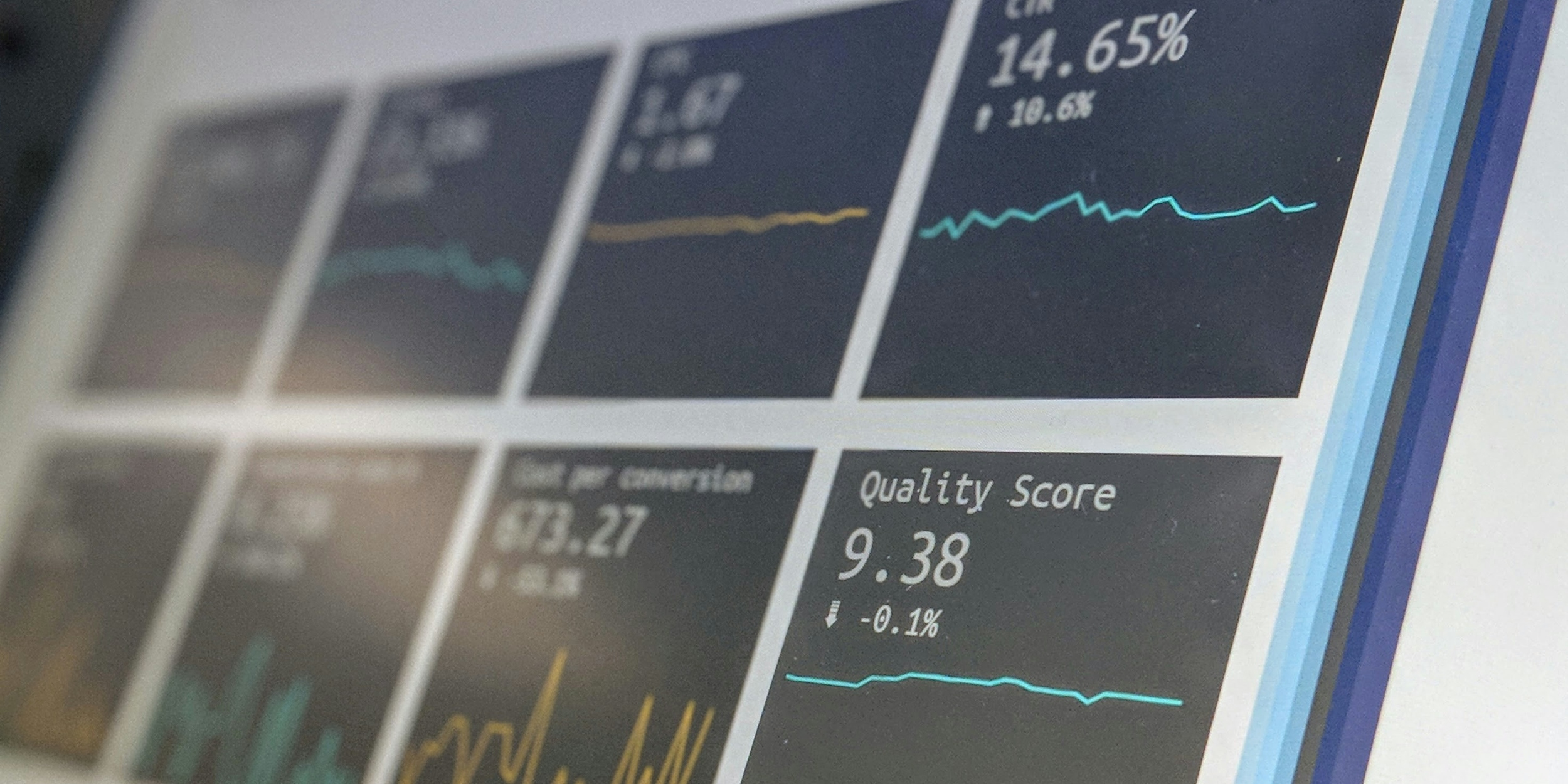
Common use cases for AR include education and training, product visualization, streamlined operations, and data visualization and analytics.

Discover why user research is crucial in software development. Learn effective methods to understand & meet user needs for successful digital products

Focusing on value delivery—rather than just feature count—combines your business goals with your users’ needs to achieve real software ROI.

Product roadmaps are a strategic guide that outlines the development team’s intended direction. Learn how they help us make better decisions.